Web Components in Action — How to Build a Design System
- Published on
Consistency and scalability are crucial in web development, especially when managing design systems across various projects. At Bridge the Gap, we've effectively used Web Components to tackle these challenges. In this article, we'll share how Web Components can enhance design systems. Information below is based on real-world experience our team gained from working on client projects. You'll find very specific code examples and an exemplary library of Web Components with a full setup. We will cover the technical stack, our development process, and the benefits we've experienced. All to providive practical insights for implementing similar solutions in your projects.

Understanding Web Components in the Context of Design Systems
Web Components are a powerful tool for building modular, reusable components in web development. They consist of a set of web platform APIs that allow you to create custom, encapsulated HTML elements that can be reused across different projects and frameworks. This standardization is particularly beneficial for design systems, which require consistent, maintainable, and scalable components.
Key Features of Web Components
- Custom Elements enable the creation of new HTML tags with custom behavior.
- Shadow DOM provides encapsulation, ensuring that the component’s internal structure and styles do not interfere with the global DOM.
- HTML Templates allow for reusable chunks of markup that can be dynamically inserted into the document.
Using Web Components in design systems offers several advantages. They ensure consistency by applying the same functionality and design uniformly across different parts of an application or multiple applications. For instance, consider a project with numerous forms utilizing form elements. Whether these forms are part of a web app built with React or an admin panel in Angular or Vue, the same Web Components can be used to maintain a uniform look and feel. Additionally, Web Components can be incorporated into the product’s documentation. In our B2B design system, developers could directly use Web Components from the library in their documentation system, enhancing consistency and usability.
Together with our client, we chose to use Lit framework for building Web Components due to its ease of use, performance, and strong community support. We also considered Stencil, but after thorough research, Lit proved to be the better option for our needs. Lit simplifies the creation of fast, interoperable Web Components with a straightforward syntax and efficient rendering. Thanks to using Lit, our Web Components library could serve in all the browsers.
Challenges and Solutions in Using Web Components
Implementing Web Components in design systems comes with its own set of challenges. However, with the right approach and tools, these challenges can be effectively addressed to make the most of Web Components.
Server-Side Rendering (SSR) and Progressive Enhancement
Web Components, by default, are client-side technologies, and integrating them into environments that rely heavily on SSR can be problematic. This can affect initial load times and SEO, as the content needs to be rendered on the client-side after the initial HTML is loaded. We tackled this by designing our Web Components to be lightweight and efficient. Using Lit, we minimized component complexity and size, which improved performance even in client-side rendering scenarios.
Compatibility with Older Browsers
While modern browsers support Web Components, some older browsers do not, which can lead to inconsistent behavior across different user environments. Polyfills can help, but they add extra overhead and complexity. As mentioned, in our project, we chose the Lit framework to build our Web Components, which significantly mitigates these compatibility issues. Lit ensures that the components perform well even in environments where full native support for Web Components is not available.
Framework Integration
Integrating Web Components with various JavaScript frameworks can present challenges. Frameworks like React, Vue and Angular have their own ways of handling data binding, event propagation, and state management. Making Web Components work seamlessly within these frameworks requires additional effort. In our project, we paid special attention to these challenges to ensure a seamless integration process. We not only built the library but also tested it with a couple of sample applications to see how the components could be integrated with the frameworks used in our client's products. This helped us catch bugs early before the components were released.
Additionally, our library was designed to be served as one piece, allowing it to be linked into any system as a script. This flexibility made it easier to integrate our components into 3rd-party documentation system and render them in texts for illustration.
Case Study: Our Web Components Library
To give you a practical example, we've put together an exemplary repository showcasing the best practices we've learned from our recent projects. This isn't code from any client, but a new repository designed to illustrate our approach. You can check it out on GitHub and explore the detailed component documentation on Storybook.
This library features a Button component to demonstrate creating reusable components. Here's the stack we used: TypeScript, Lit, PostCSS, Vite.
Storybook Integration
In all our recent projects, we've used Storybook to document components. We did consider other options, but Storybook consistently proved to be the best choice. So, we used it for this library too. Storybook lets developers explore and test components interactively, with features like:
- Detailed Documentation for attributes, properties, and CSS.
- Accessibility and Actions Testing, with the help of Storybook addons.
- Interactive UI as the key feature of Storybook.
- Pull Request Previews which you can explore by example https://github.com/bridge-design/wc-design-system/pull/1
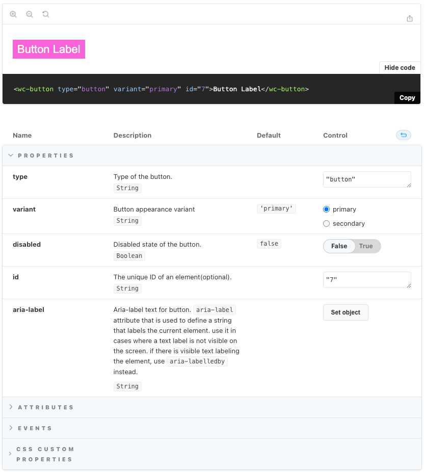
The library features a single component—the Button. You can see it in action in Storybook. It’s a detailed example showing how to document and interact with a component, demonstrating its features.
Detailed Look at the Button Component
Let’s dive into the details of our Button component — it is a simple but nice example of how to create reusable and customizable Web Component.
Component Description
You can find the code for the Button component in our GitHub repository and explore it in Storybook.
Note its features:
- Customizable: The component is designed to be highly customizable using CSS variables and properties.
- Documented: Every property and CSS variable is well-documented, making it easy to understand and use.
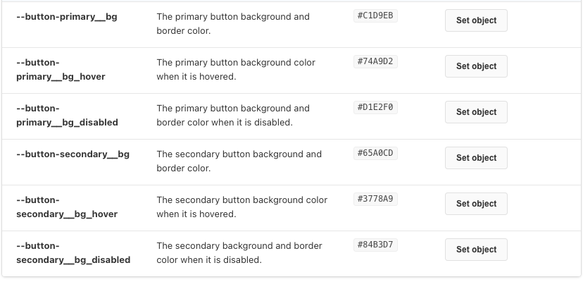
Customization with CSS Variables
One of the standout features of the components in our client project is that they use of CSS variables for customization. In the exemplary library we demonstrate the same feature. This approach allows developers to easily modify the look and feel of the button without altering the core component code. For example, in the button.css file, we define several CSS variables like --button-background-color and --button-text-color:
:host {
  --button-background-color: #007bff;
  --button-text-color: #fff;
  --button-border-radius: 4px;
  display: inline-block;
}

button {
  background-color: var(--button-background-color);
  color: var(--button-text-color);
  border-radius: var(--button-border-radius);
  /* other styles */
}
When a developer includes the button component in their HTML, they can override the default CSS variables by setting new values within the scope of the component. This is done by defining the CSS variables in the parent element or directly on the component itself. In pure HTML it would look like the following:
<!-- Default Button with no custom styles -->
<my-button></my-button>

<!-- Custom Button with redefined styles -->
<my-button
  style="
      --button-background-color: #28a745;
      --button-text-color: #fff;
      --button-border-radius: 8px;
"></my-button>
When using frameworks, the approach may slightly vary. For example, for Vue to make CSS variable to apply only within a specific component (scoped to that component), you can do so within a <style scoped> block.
<template>
  <div>
    <!-- Button with custom styles applied through scoped styles -->
    <my-button></my-button>
  </div>
</template>

<style scoped>
my-button {
  --button-background-color: #28a745;
  --button-text-color: #fff;
  --button-border-radius: 8px;
}
</style>

<script>
export default {
  name: 'App',
};
</script>
In the component's code, each CSS variable is documented with comments, which are also reflected in Storybook under the "Custom CSS Properties" section. This documentation ensures that anyone using the component knows exactly what variables are available for customization.
Properties and Events
The Button component also takes advantage of Lit’s capabilities to handle properties and events. Each property is documented in the code and rendered in Storybook's properties table, making it clear what each property does.
For example, the disabled property is defined and documented as follows:
/**
  * Disabled state of the button.
  * @attr disabled
  * @type {Boolean}
  */
@property({ reflect: true, type: Boolean })
disabled = false;
With Lit, we bind properties to the component's attributes and events using special syntax:
- Boolean Attributes: The
?prefix is used for boolean attributes. For example,?disabled=${this.disabled}binds thedisabledattribute to the component. - Property Binding: The
.prefix is used for property binding. For example,.aria-labelledby="${this.ariaLabelledBy}"binds thearia-labelledbyproperty. - Event Handling: The
@prefix is used for event handling. For example,@blur=${this.handleBlur}binds theblurevent to thehandleBlurmethod.
Here’s a snippet showing these bindings in action:
render() {
  return html`
    <button
      ?disabled=${this.disabled}
      .aria-labelledby="${this.ariaLabelledBy}"
      @blur=${this.handleBlur}>
      <slot></slot>
    </button>
    `;
}
Additional Lit Features
In addition to the features used in the Button component, Lit provides other useful capabilities for building web components:
- Event Options: You can use the
@event=${handler} optionssyntax to add event listeners with specific options likecaptureorpassive. - Directives: Lit offers several built-in directives like
repeat,ifDefined, andcache, which help manage complex rendering logic efficiently.
By utilizing these features, we ensure that our Button component is not only flexible and customizable but also efficient and easy to integrate into various applications.
Real-world Applications and Success Stories
Web Components have found their place in the tech stacks of various large enterprises, showcasing their versatility and benefits in real-world applications. Below, there are just a few examples that inspired us.

Auro
Enables design and development for Alaska Airlines

Nord
Nordhealth’s design system for brand, products and digital experiences.

Spectrum Web Components
An implementation of Spectrum, Adobe’s design system.

Carbon for IBM.com Web Components
Carbon for IBM.com Web Components
The is a lot of other notable Web Components libraries, with many of them open sourced. Studying their code and approaches to documentation may leverage your system too. You can find a larger list here:
https://webcomponents.today/design-systems/
Best Practices for Developing Web Components in Design Systems
Building Web Components for a design system requires a thoughtful approach to ensure they are reusable, maintainable, and integrate well with various frameworks. Here are some best practices we’ve honed over our projects.
Making Components Framework-Agnostic
One of the main strengths of Web Components is their ability to work across different frameworks. This is crucial for maintaining consistency when your project ecosystem involves multiple frameworks like React, Angular, and Vue. The key is to ensure that the components are designed to be framework-agnostic from the start. This means avoiding framework-specific features and sticking to standard web APIs. For example, we made sure our Button component could be easily integrated into any framework by using standard HTML, CSS, and JavaScript.
React Example:
import React from 'react'
import 'wc-design-system/button'

const App = () => (
  <div>
    <wc-button disabled={false} onClick={() => alert('Button clicked!')}>
      Click Me
    </wc-button>
  </div>
)

export default App
Vue Example:
<template>
  <div>
    <wc-button :disabled="false" @click="handleClick"><Click Me/wc-button>
  </div>
</template>

<script>
export default {
  methods: {
    handleClick() {
      alert('Button clicked!');
    }
  }
}
</script>
Emphasizing Customization
For some design systems, ability to customize is the must. This was often the case with our clients. As you could see from the example, the Button component uses CSS variables to allow customization without altering the core component code. This makes it easy to tweak the appearance to fit different brand guidelines or project requirements. Developers can then override these variables in their projects to customize the button's look.
Deciding What Goes Into the Design System
Deciding what goes into the design system as a Web Component and what stays within the application is a critical decision. Generally, components that are reused across multiple projects or have the potential to be reused should be part of the design system. Application-specific logic or highly specialized components are better kept within the application codebase.
When creating a new component, the process typically involves:
- Design and Specification: Collaborate with designers to define the component’s appearance and behavior.
- Development: Build the component using Lit, ensuring it adheres to design specifications and is highly configurable.
- Documentation: Use Storybook to document the component. Include usage examples, detailed descriptions of properties and events, and visual tests.
- Testing: Implement accessibility and actions testing to catch issues early. Use tools like Jest for unit tests.
- Review and Iteration: Generate browser-based previews for pull requests to allow for thorough review and feedback.
Note that steps 3, 4 and 5 were fully or partly automated—that was again possible due to right choice of the tools and/or investing into setup.
Steps for Creating and Delivering Components
Creating a new component involves several steps. First, we collaborate with designers to nail down the look and functionality. Next, we dive into development, using Lit to keep things light and efficient. We document everything in Storybook, which has become our go-to for showing how components work and can be customized. Testing is also a big part of the process—both automated tests and manual ones to catch any potential issues. Finally, we use pull request previews to review changes before they go live, ensuring that everything works as expected.
Takeaways from Our Journey
Web Components have proven to be a powerful tool for creating scalable and consistent design systems. They allow developers to build reusable, encapsulated HTML tags that integrate smoothly with any JavaScript framework or even directly to a pure HTML page. At Bridge the Gap, we've seen firsthand how Web Components can simplify development, enhance maintainability, and ensure a cohesive user experience.
Throughout our journey, we chose Lit for its performance, ease of use, and strong community support. This choice enabled us to build a robust design system that caters to our clients' diverse needs. Our Web Components library, well-documented with Storybook, highlights the practical application of these technologies, focusing on customization and reusability.
Real-world examples from companies (we listed some of them) demonstrate the transformative potential of Web Components. These companies have successfully integrated Web Components into their design systems, achieving scalability, improved performance, and consistent user interfaces across their digital products.
As you explore our example repository and consider adopting Web Components for your projects, we hope our insights and practices offer valuable guidance.