Building Better Together - The Revamp of Manychat’s Design System
- Published on
This article is originally published on Manychat Engineering Blog.
For a fast-paced, feature-rich application like Manychat messaging platform, consistent and scalable user interfaces are crucial. The backbone for such interfaces is a solid and polished design system. As Manychat is continuously evolving to meet user needs, improving their design system wasn’t just a nice-to-have — it was essential. With this system, Manychat can support rapid product growth while ensuring a great experience for both developers and designers.

Collaboration for Additional Expertise
Manychat’s engineering team is incredibly skilled and resourceful. They could have handled the design system internally. However, with engineers focused on shipping features quickly, dedicating resources to this task was challenging. That’s why Manychat decided to work with us — Bridge the Gap.
We specialize in design systems, with experience across industries and deep knowledge of common challenges. This allowed us to deliver faster and with more precision, ensuring Manychat’s design system could match their dynamic product.
The success of any project hinges on effective collaboration, and working on a design system is no exception. We worked closely with Manychat’s tech lead, Valeria Karzhova, and the design team. Weekly syncs helped us stay aligned on technical and design goals, while quarterly roadmap reviews ensured we stayed on track. While in general, we are a remote team, we also spent a week onsite in Barcelona (such an excuse!). This helped build strong relationships and contributed to the project’s success.
Building Better Components
Every great design system project begins with understanding the current state. First, we conducted a detailed audit. We cataloged the existing React component library, identified technical debt, mapped out missing and inconsistent components and overall possible improvements to the system. This helped us determine which components needed refactoring, where there were documentation gaps, get a list of missing components for implementation, and foresee the need for structural improvements. When the boost sprint was wrapped, we delivered 20 new components, refactored several more, and resolved key inconsistencies.
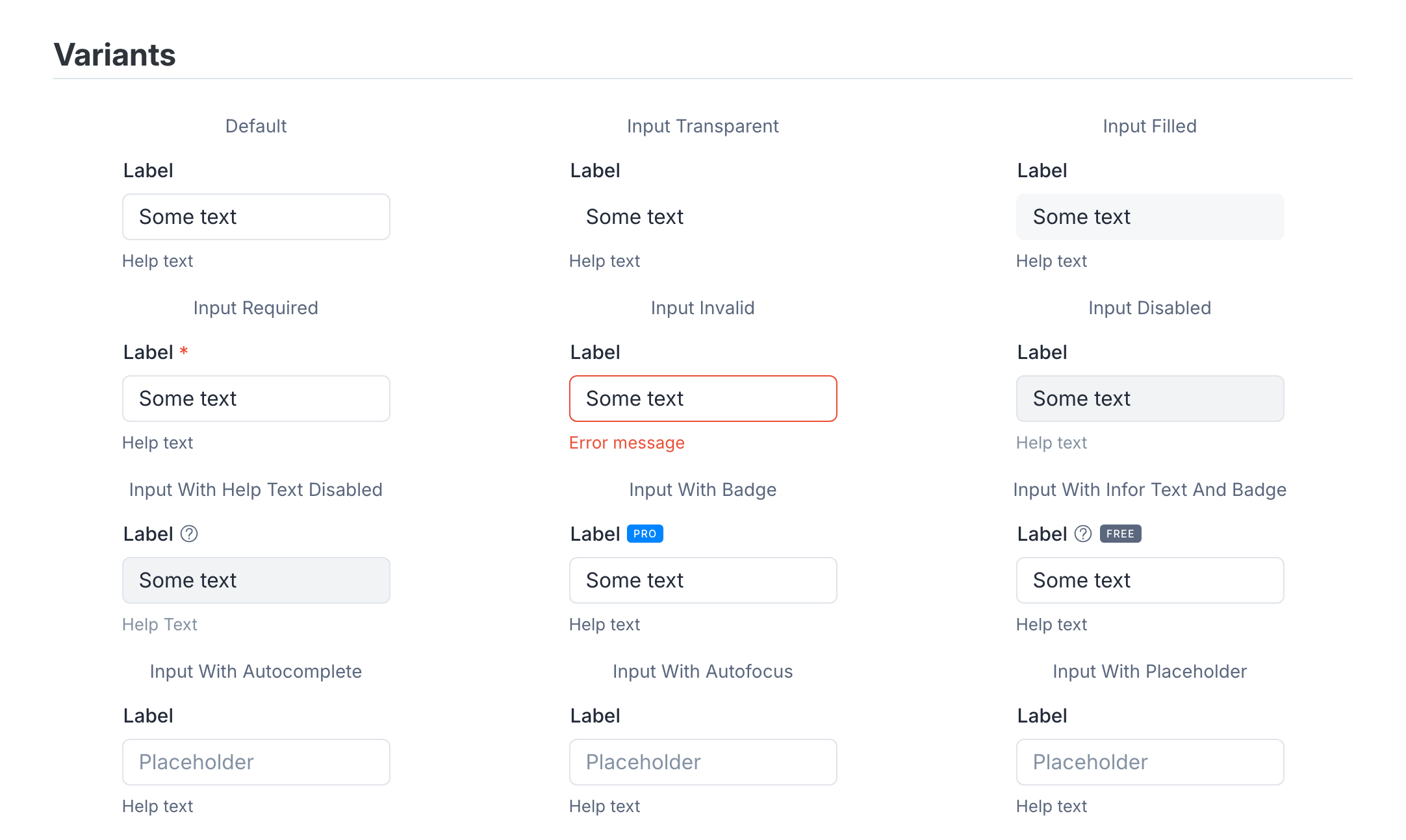
We built a scalable foundation for Manychat’s form elements — text inputs, toggles, checkboxes, and buttons. In this context, scalability means that a component’s technical architecture is aligned with the design framework behind these elements. Such work requires that design system engineers deeply collaborate with the designers and grasp the very idea behind every design decision in the controls. This effort paid off — we managed to provide well-structured architecture that helps create new controls. They inherit tokens, interfaces, and functionality from the foundation we built.
Work on the components included providing systematic changes that positively affected the development process and the code quality. For example, we provided type checking of a11y attributes of all input components. The already mentioned foundation for the controls is now based on a type that requires developers to provide one of the ARIA attributes: label, ariaLabel, or ariaLabelledBy. A small change in the code of the component, but a dramatic positive effect on the whole product.
Besides working on the components, we put a lot of effort into adopting them into a product. This is something many design system teams miss, hoping the product teams do this job instead. While following the rule of work split, this approach is theoretically correct, our experience with Manychat Design System demonstrated that adopting components with the help of design system engineers was a strategically good move.
The Power of Ultra-Defined Components
When creating components, we followed a method we’ve used successfully in other projects. We call it ultra definition. This means providing a complete description of a component (interface, functionality, test cases to cover, etc) before implementation begins.
The process starts with research. First, we conduct a codebase review which helps to find out similar components or functionality in the product. That knowledge pays off when designing for backwards compatibility. Next, we check out what other design systems are doing to solve similar problems. Even though third-party implementation usually cannot be directly adopted, having it as a benchmark helps us master our own better-tailored solution.
Practicing such ultra definition made it possible for us design system developers to have an on-point discussion with the Manychat designer and tech lead. When this discussion happens before implementation starts, it ensures that we agree on most things beforehand. As most questions are answered upfront, development speeds up.
Naturally, the hands-on development of the components starts with making interfaces. With the interface set up, we write nearly all the tests first, and then move on to implementing the component itself. In fact, component definition contains all the tests to cover, just in the form of human-readable text. Thanks to this approach, we managed to be test-driven in our development — this approach is an industry-proven method for quality.
After that, in many cases, providing component functionality is a no-brainer. Sometimes, even Co-pilot does it from its first attempt. Working this way changes the end quality so much that we published an example of such an ultra-defined component in our team blog. Check out here: https://bridge-the-gap.dev/blog/design-system-define-components/
Better Documentation with Smarter Storybook
The next key stone was documentation. In the design systems world, this is as important as the components themselves — documentation ensures developer experience inside the company. For the first step, we upgraded Storybook from version 6 to 8. That allowed us to introduce 100% autogenerated documentation and interactive layouts. Design system engineers no longer need to write documentation separately; it is derived directly from the code.
We also customized the Storybook layout to improve UX for the design system documentation. Thanks to providing custom layout for the Docs section, and custom components rendered there, Manychat’s Storybook instance now offers a grid for compact presentation of the stories. Done once on the global level, this feature automatically works for all the components, including future ones.
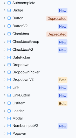
We provided status tags to mark the components in the Storybook sidebar. A few months ago, when we implemented it, this feature wasn’t built into Storybook yet and required some custom coding.
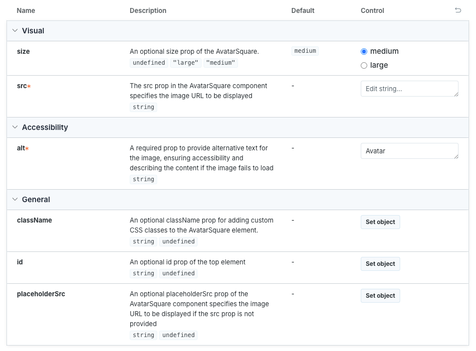
Categories for component properties are another example of how the documentation was enhanced. We developed a code extension for the Storybook instance that automatically classifies properties into categories such as Visual, Accessibility, Events, Attributes, and General. For most components and their properties, our extension organizes these categories without requiring additional effort from the developer. However, developers can still manually assign categories if needed. This results in significantly improved navigation for product developers within the property table.
While technically this change feels minor, it provided a noticeable impact on making the whole workflow much more structured. Also, it is a great communication tool about the progress in the components. And for product teams, the statuses navigate them when adopting new components.
##Growing a Design System Community
To ensure the development experience further, our team participated in building an in-house community around the Manychat design system. This work was led by Manychat’s tech lead, Valeria Karzhova, with support from our extensive experience on similar projects. This type of task is somewhat different (and maybe unusual) from what tech leads typically do. When popularizing a design system across your own company, you need to apply some marketing, be a meeting facilitator, and develop product strategies, among other things. It was good to see how our contribution, backed by our experience, can provide a significant improvement in all these aspects.
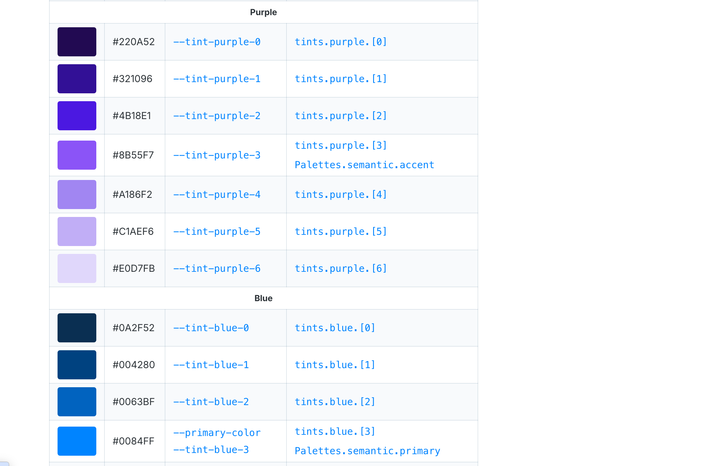
One of the examples of a successful feedback loop with product engineers is how we changed representations of colors and spacings documented in Storybook. Even though they have been documented, product developers still had requests to change the representation to make their navigation through documentation much easier. This feedback was shared at the first community meeting organized around the design system. And immediately responded.
Before the change, colors were illustrated but only the end values were provided.
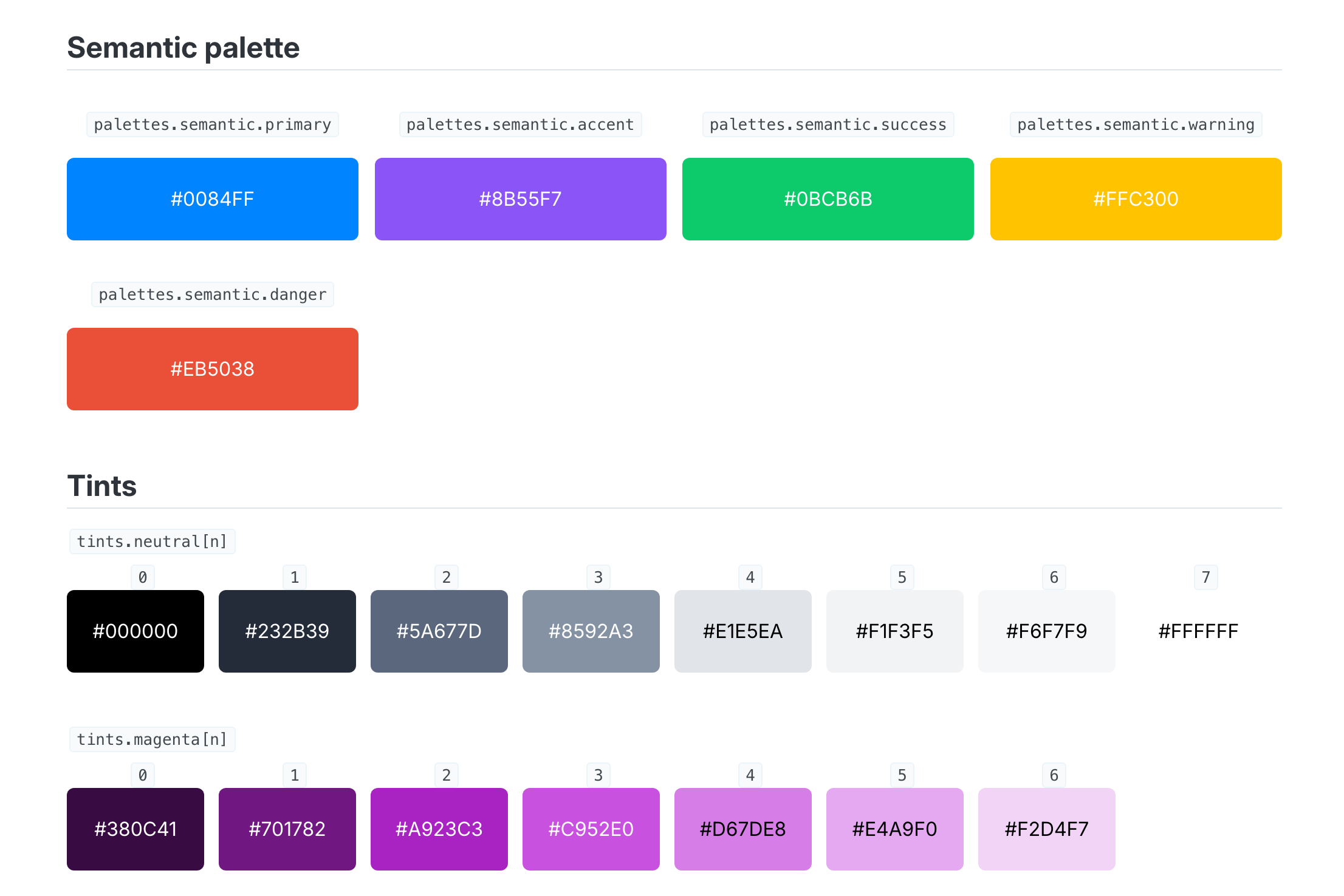
After the change, the list of colors was enriched with the design tokens they are referred with, as CSS and JavaScript variables.
As for spacings, they were nicely illustrated but the way of using was not obvious.
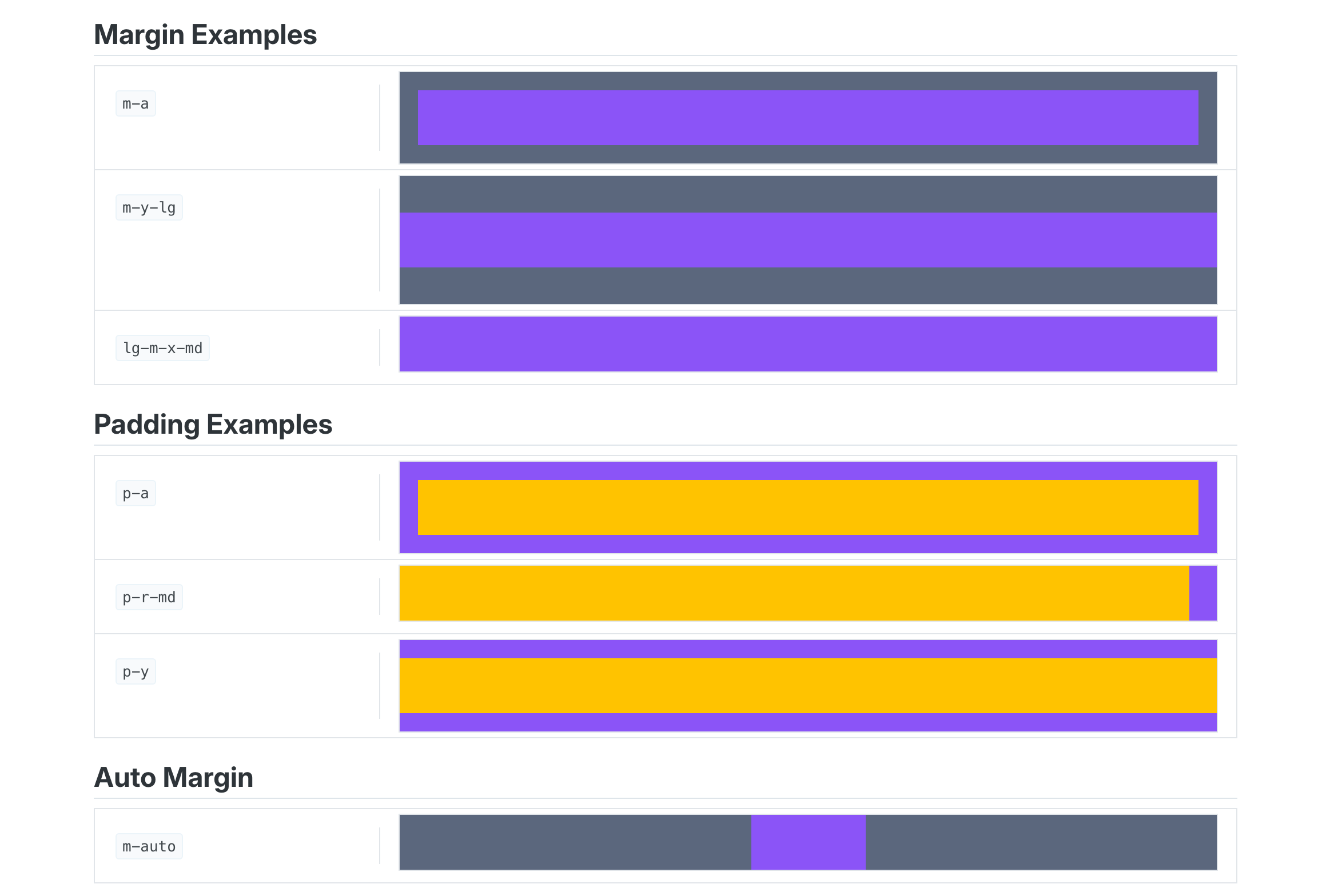
The documentation improvement helped represent the spaces together with the CSS classes that provide them, their direct values and visual representation for better developer experience.

The new view looks nicer and presents all the information developers were looking for, such as names of CSS variables for colors, and CSS classes to apply spacing values to HTML elements.
Continuing the Journey
This project has set Manychat’s design system on a clear path toward sustainable growth and innovation. By modernizing tooling, creating robust foundations, and embedding a culture of collaboration, the design system is now ready to empower product teams rather than constrain them.
Our experience proved that ultra-defined components significantly reduce implementation time and improve quality, while direct involvement in component adoption accelerates system-wide improvements. Once again, we learned that community building is as crucial as technical excellence, and quick responses to developer feedback build trust and engagement.
The success of this partnership demonstrates how specialized expertise and a systematic approach can transform even the most ambitious goals into achievable milestones. For companies navigating similar challenges, this experience offers a valuable lesson: Investing in a design system isn’t just about components or documentation — it’s about enabling teams to deliver their best work. A design system doesn’t only improve design and developer experience, it becomes a foundation for tomorrow’s opportunities.
This article is originally published on Manychat Engineering Blog.