Define your Rock-Solid Design System Components
- Published on
In our team, defining components is super important. It makes sure everyone's on the same page, especially since we work remotely and come from different backgrounds. Having a clear understanding from the start is key to avoiding confusion later on. That's where our design system architect comes in – they're like a super sleuth who makes sure no detail gets missed when we define our components.
Why defining components matters?
The very first step, defining what each component does, is essential for the entire development process. It acts as a bridge between design and development, ensuring everyone on the team is on the same page, regardless of location or background. This focus on defining components upfront helps us avoid misunderstandings later and ensures the final product meets all the requirements.
Our design system architect plays a key role in this process. Their extensive experience and sharp eye for detail often catch things the design team might miss. Their main focus is making sure our components are not only visually consistent but also functionally strong and easy to maintain in the long run.
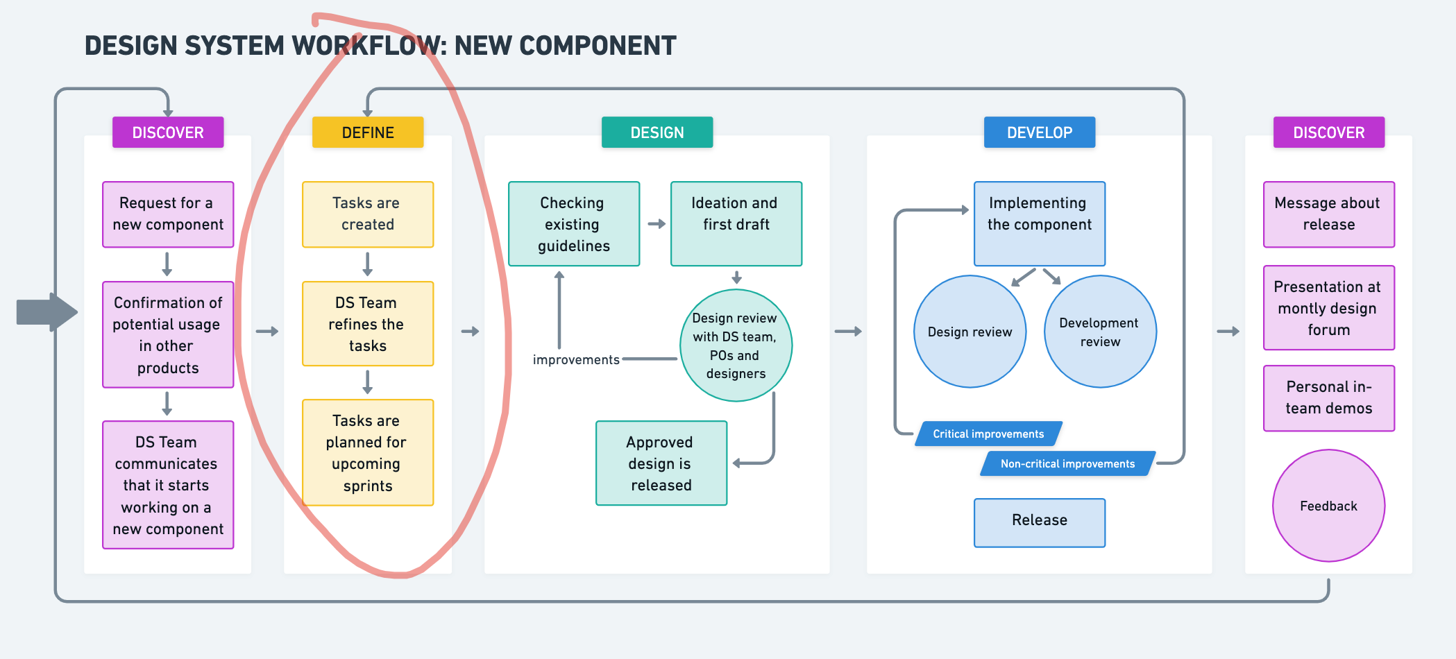
How we nail down our components
Here's the step-by-step process for defining our components:
1. Digging into the Code and Beyond
The definition process begins with research. This involves two key areas:
- Internal Codebase Review: First, we take a deep dive into our existing code to see if something similar already exists. This way, we can make sure all the features we need are there. If anything needs to be changed, we explain why and come up with even better options.
- Industry Research: Next, we hit the books – well, kind of. We check out what other design systems built with similar tools (like React or Web Components) are doing. We don't just copy everything though, we pick what works best for our specific product.
2. Blueprinting the Component
Once we've gathered all this info, the design system architect puts together a detailed blueprint of the component. This basically lists everything the component can do, how it can be adjusted, and any tricky situations it might encounter. Think of it as a roadmap for building the component.
3. Team Huddle to Finalize
The whole team then gets involved to make sure this blueprint is solid. Designers and developers chat about the component together. This helps ensure the design can actually be built and includes everything that's needed. By the end, we have a refined component description that's clear and complete.
The Perks of Planning Our Components
We've been using this approach for a while now on many projects, and it's definitely a winner! Here's why:
One of the key benefits of this approach is enhanced communication. Because our descriptions are clear and detailed, everyone on the team understands exactly what the component does. This is especially helpful for our remote and culturally diverse team, where misunderstandings can sometimes happen.
Additionally, this method increases efficiency. With all the details written down, developers can jump right into coding without having to guess what's required. This saves us a bunch of time!
By taking the time to plan things out carefully, we end up with components that are well-tested and dependable. For example, with detailed component definitions, it becomes easier to practice Test-Driven Development (TDD). Often, the definition itself contains a list of tests to cover. If not, these tests are still straightforward to create before the implementation begins, ensuring a smooth development process.
Below is an example of a component description for a new Popover component:
Popover Component Description
There is a new <Popover> component to enhance user interaction by displaying additional information or controls. It fits the new design as shown in Figma.
Parameters
Controlled State
open(optional): A boolean parameter that controls the open state of the Popover. Whentrue, the Popover is displayed. Whenfalse, it is hidden. Must be used in conjunction withonOpenChange.onOpenChange(optional): A function parameter that takes a callback function, triggered when the open state changes.
Positioning and Alignment
side(optional): A string parameter that specifies the position of the Popover relative to its trigger element. Possible values aretop,bottom,left, andright. Default isbottom.align(optional): A string parameter that specifies the alignment of the Popover relative to its trigger element. Possible values arestart,center, andend. Default iscenter.sideOffset(optional): A number parameter that sets the distance from the trigger element. Default is2.alignOffset(optional): A number parameter that sets an offset from the alignment optionsstartorend.
Collision Handling
avoidCollisions(optional): A boolean parameter that, whentrue, overrides thesideandalignpreferences to prevent collisions with boundary edges. Default isfalse.
Display and Content
displayTip(optional): A boolean parameter that determines whether to display a tooltip arrow within the Popover. Whentrue, a tooltip arrow is displayed. Default isfalse.children(optional): A ReactNode parameter that specifies the content to be displayed within the Popover container.
Styling and Customization
className(optional): A string parameter that sets custom CSS classes for the Popover container.id(optional): A string parameter that sets a unique identifier for the Popover container.tabIndex(optional): A number parameter that sets the tab index for keyboard navigation. Default is0.
Events
onChange(optional): A function parameter that takes a callback function, triggered when the Popover content changes.onFocus(optional): A function parameter that takes a callback function, triggered when the Popover gets focus.onBlur(optional): A function parameter that takes a callback function, triggered when the Popover loses focus.
Accessibility
The Popover component adheres to several accessibility standards:
- The root element of the Popover uses
role="dialog"to indicate it is a dialog. - The trigger element should be focusable and interactive, ensuring it can be activated via keyboard navigation.
- When the Popover is open, it sets
aria-expanded="true"on the trigger element to indicate the expanded state. - The Popover content should be easily dismissible, either through a close button or by clicking outside the Popover.
Subcomponents
The Popover component includes several subcomponents to structure its content:
Popover.Trigger: Element that triggers the Popover.Popover.Content: Container for the Popover content.Popover.Close: Element that triggers the closing of the Popover.Popover.Anchor: Element that anchors the Popover to another element.
Example Usage
import { Popover } from "./Popover";
import { Button } from "../button";
import { Paragraph } from "../typography/typography";

const Example = () => {
  const [isOpen, setIsOpen] = useState(false);

  return (
    <Popover open={isOpen} onOpenChange={setIsOpen}>
      <Popover.Trigger asChild>
        <Button>Open</Button>
      </Popover.Trigger>
      <Popover.Content side="bottom" align="center" displayTip>
        <Paragraph size="s">
          End hunger, achieve food security, and promote sustainable agriculture.
        </Paragraph>
      </Popover.Content>
    </Popover>
  );
};
Focus and Interaction Accessibility Checks
The Popover component should pass the following accessibility checks to ensure it is user-friendly and complies with accessibility standards:
Keyboard Navigation:
- Press
Tabto focus on the Popover trigger element. - Press
TaborShift + Tabto navigate between the trigger element and other focusable elements within the Popover. - Press
SpaceorEnterto open the Popover when focused on the trigger element. - Press
Escapeto close the Popover when it is open.
- Press
Screen Reader Support:
- Ensure the Popover content is announced by screen readers when it is opened.
- Use
aria-expandedandaria-controlson the trigger element to indicate the open state and the associated Popover content.
Dismissibility:
- Clicking outside the Popover should close it.
- Include a
Popover.Closeelement or an equivalent mechanism to allow users to close the Popover.
Testing
The Popover component should be tested for the following scenarios to ensure its functionality and accessibility:
- Popover renders correctly with default props
- Popover opens when the trigger element is clicked
- Popover closes when clicking outside the Popover
- Popover closes when the close element inside the Popover is clicked
- Popover changes position based on
sideprop - Popover aligns correctly based on
alignprop - Popover respects
sideOffsetprop for positioning - Popover respects
alignOffsetprop for alignment - Popover avoids collisions with boundary edges when
avoidCollisionsis true - Popover displays a tooltip arrow when
displayTipis true - Popover content is accessible and announced by screen readers when opened
- Popover trigger element has correct
aria-expandedattribute when open - Popover trigger element has correct
aria-controlsattribute linking to the Popover content - Popover focuses correctly when opened using keyboard navigation
- Popover navigates correctly between focusable elements inside the Popover
- Popover closes when
Escapekey is pressed - Popover supports custom CSS classes via
classNameprop - Popover updates open state when
onOpenChangecallback is triggered - Popover renders with unique
idwhenidprop is provided - Popover respects custom
tabIndexfor keyboard navigation - Popover opens on hover when using
Popover.AnchorwithonMouseEnterevent - Popover maintains focus trap within the Popover when open
- Popover handles dynamic content updates correctly
- Popover remains open when clicking within its content area
- Popover supports nested popovers and their interactions correctly
Building Blocks Done Right
Our secret weapon for creating awesome components? Spending some quality time upfront to define them thoroughly. This collaborative approach ensures everything is clear, strong, and meets the needs of both designers and developers. Here's the magic it brings:
Communication Boost: No more confusion! Detailed definitions act like a shared language for everyone on the team. No matter the location or background, understanding a component's purpose and function becomes crystal clear. This is especially helpful for our remote and culturally diverse crew.
Faster Development = Happy Team: Imagine a roadmap for each component – that's what our detailed descriptions are like! With everything laid out, developers can jump right into coding without wasting time figuring things out. This translates to a significant speed boost for the entire development process.
Strong Foundations, Reliable Results: Taking the time to plan each component from the start pays off big time. These detailed plans lead to rock-solid, well-tested components that we can rely on throughout the project. Plus, they're built to scale and easy to maintain, which is crucial for long-term success.
This focus on defining components from the beginning acts like a clear blueprint for development. It even works hand-in-hand with a method called Test-Driven Development. Basically, we can write comprehensive tests early on to catch any issues before they become problems. These tests also act as living documentation, making it easier to maintain the components and onboard new team members in the future.
Want to see this in action? Check out the success stories on our case studies page. By consistently using this approach, we create high-quality, easy-to-maintain products that meet both design standards and user needs – a win for everyone!